PROBLEM
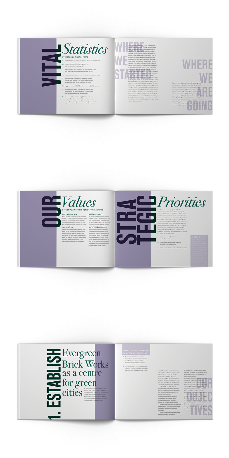
Redesign Evergreen’s Strategic Plan report without using any imagery, just typography and colour. The report has a significant amount of copy, so it will be important to organize the pages in a structured and consistent way throughout the report.
SOLUTION
By using multiple different types of contrast in the typography I was able to create a hierarchy that established important headings and subheadings in a consistent way throughout the report. This technique also created an interesting and bold visual with each heading. Using a grid was essential in organizing each page so that I could use the white space as a part of the design.
SOFTWARE USED

