PROBLEM
Design a brand identity, as well as corresponding materials, for the start of a new condominium project. There will be a brochure, a folder and a website that will be utilizing the brand identity that is created. The brand identity will need to be versatile enough to move across all mentioned mediums, while still encapsulating the structure and stability that condominiums should project.
SOLUTION
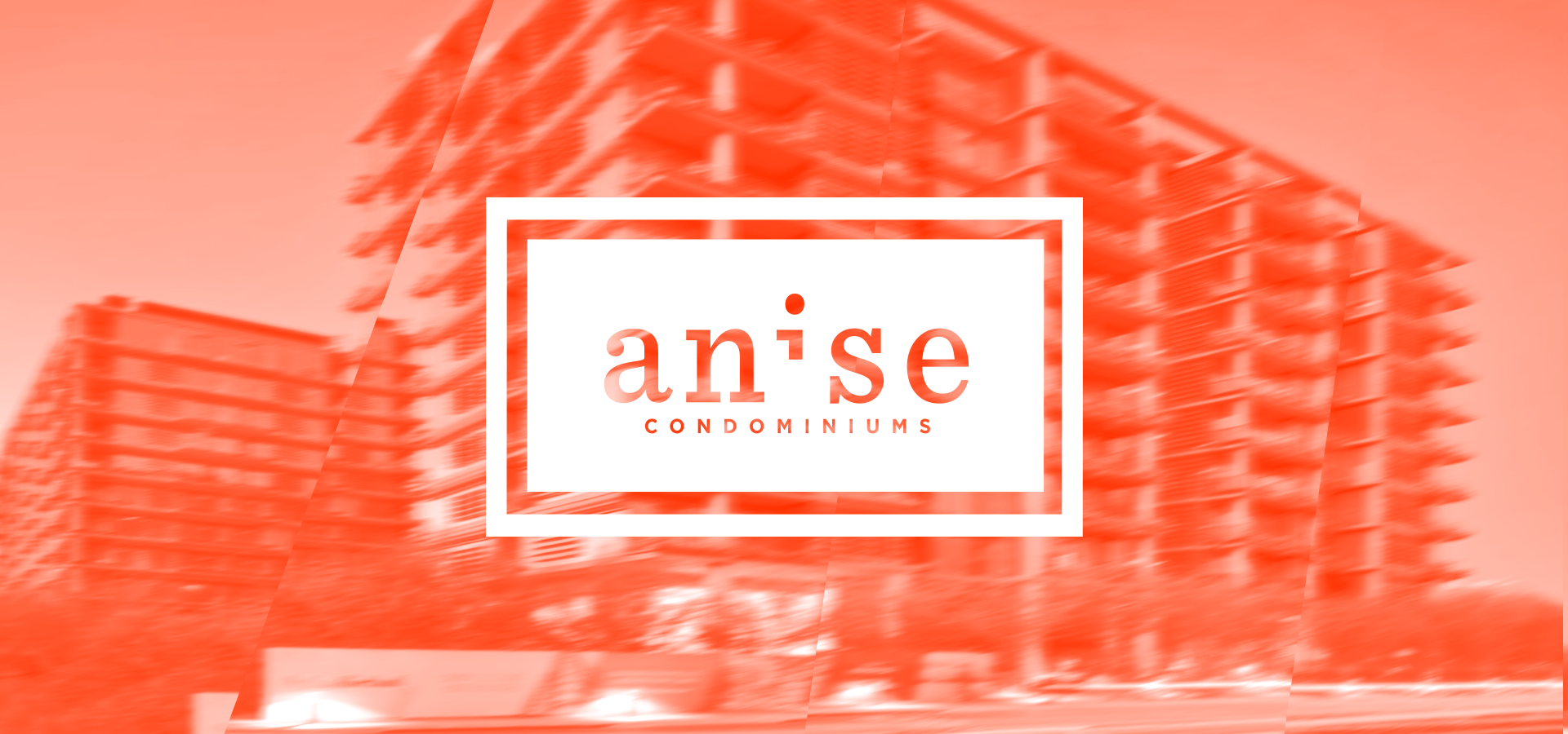
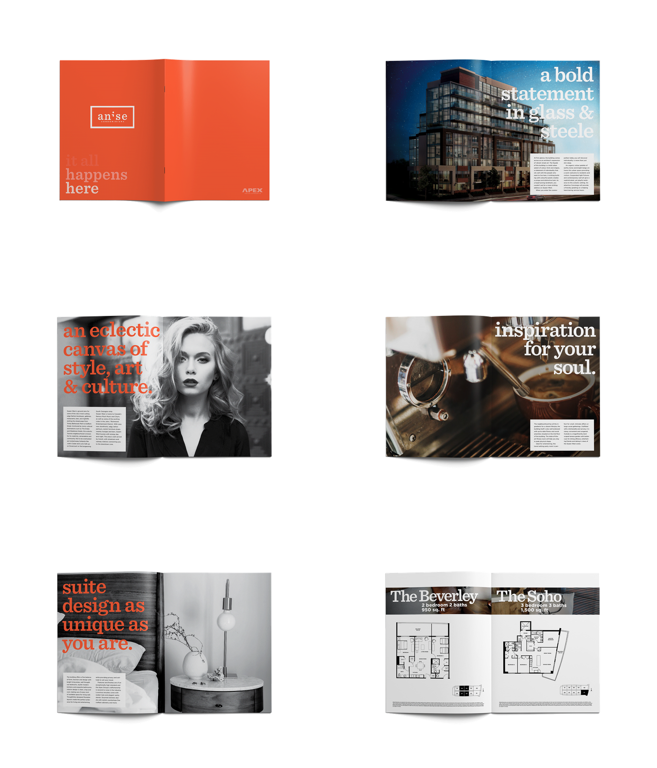
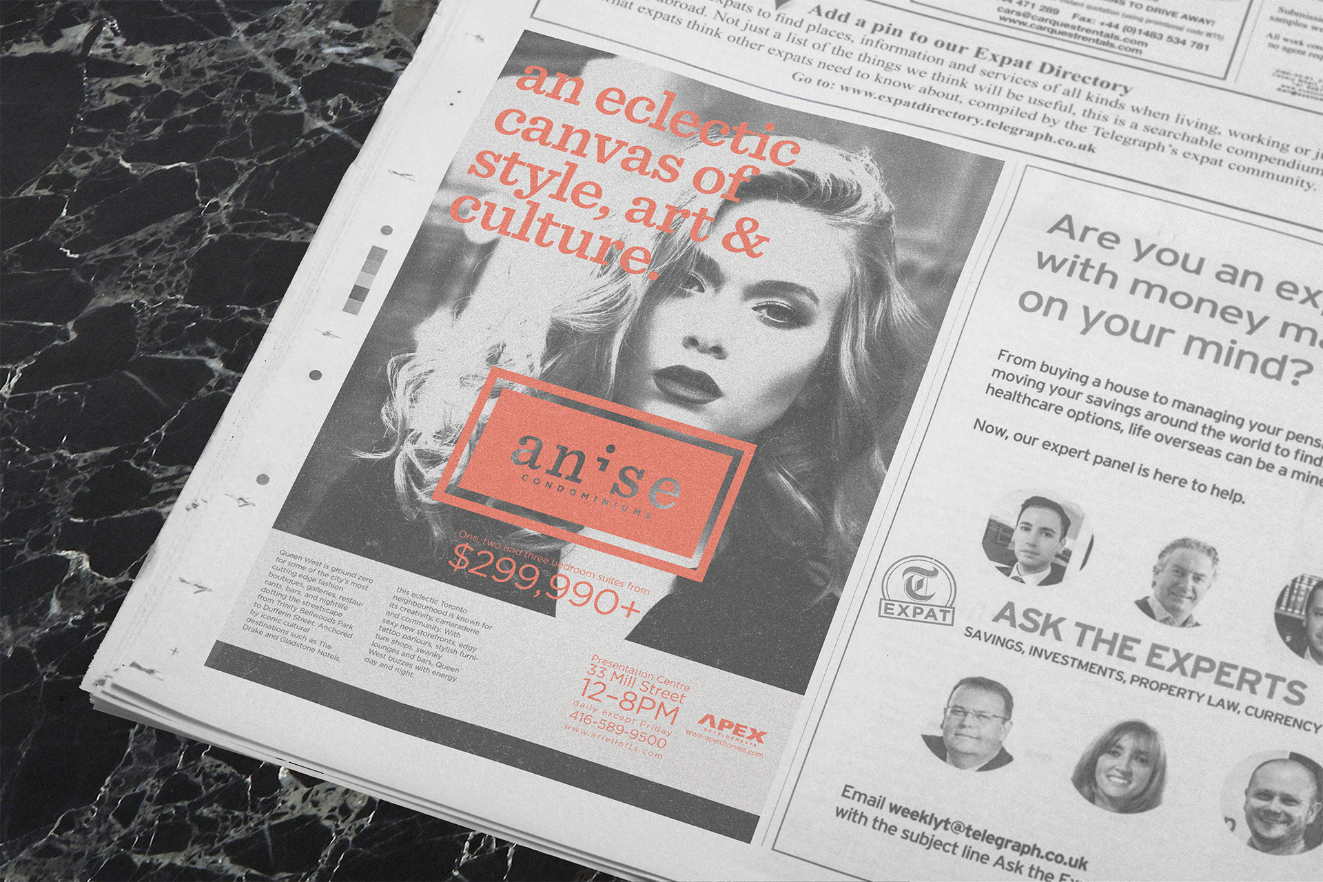
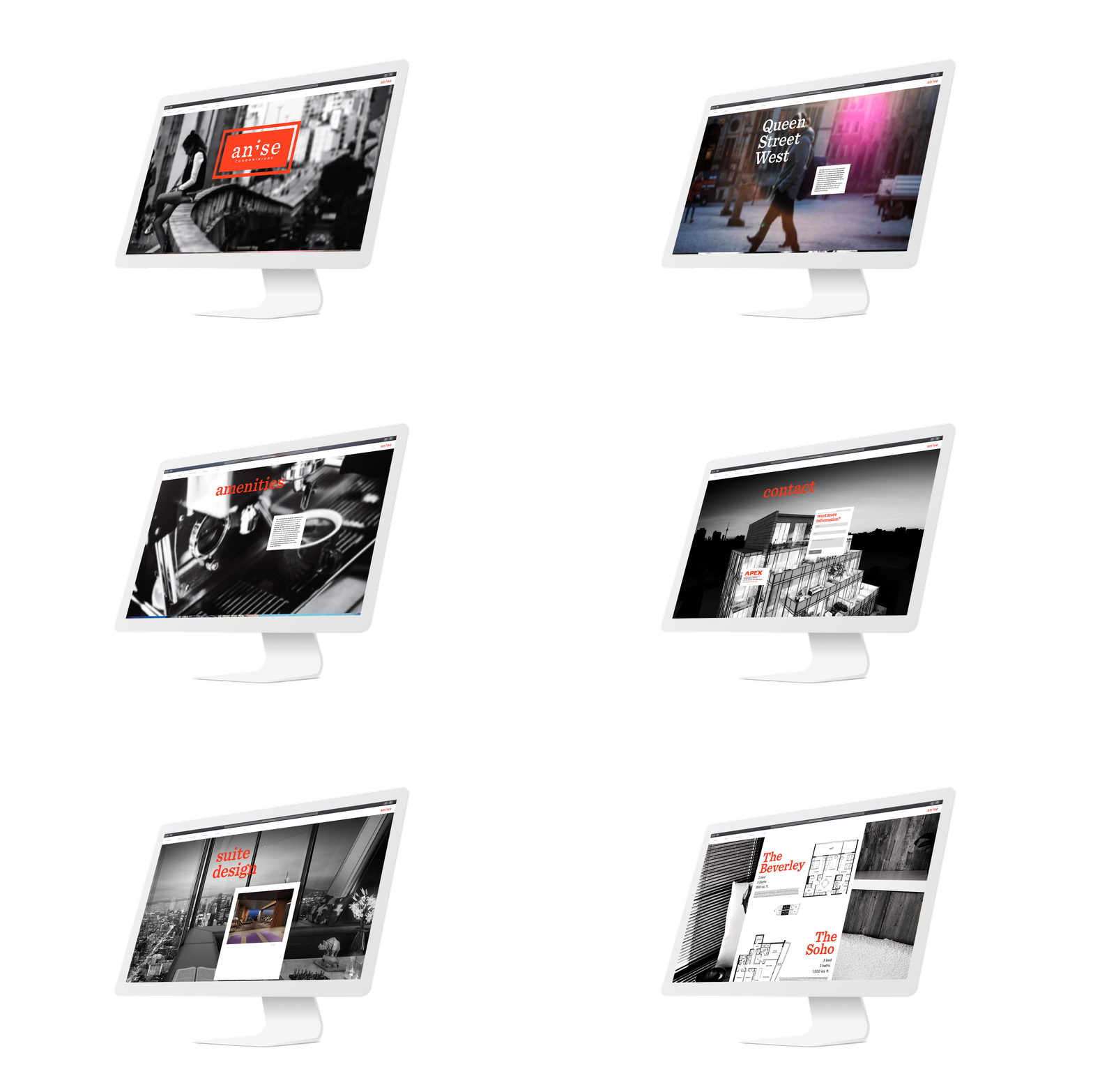
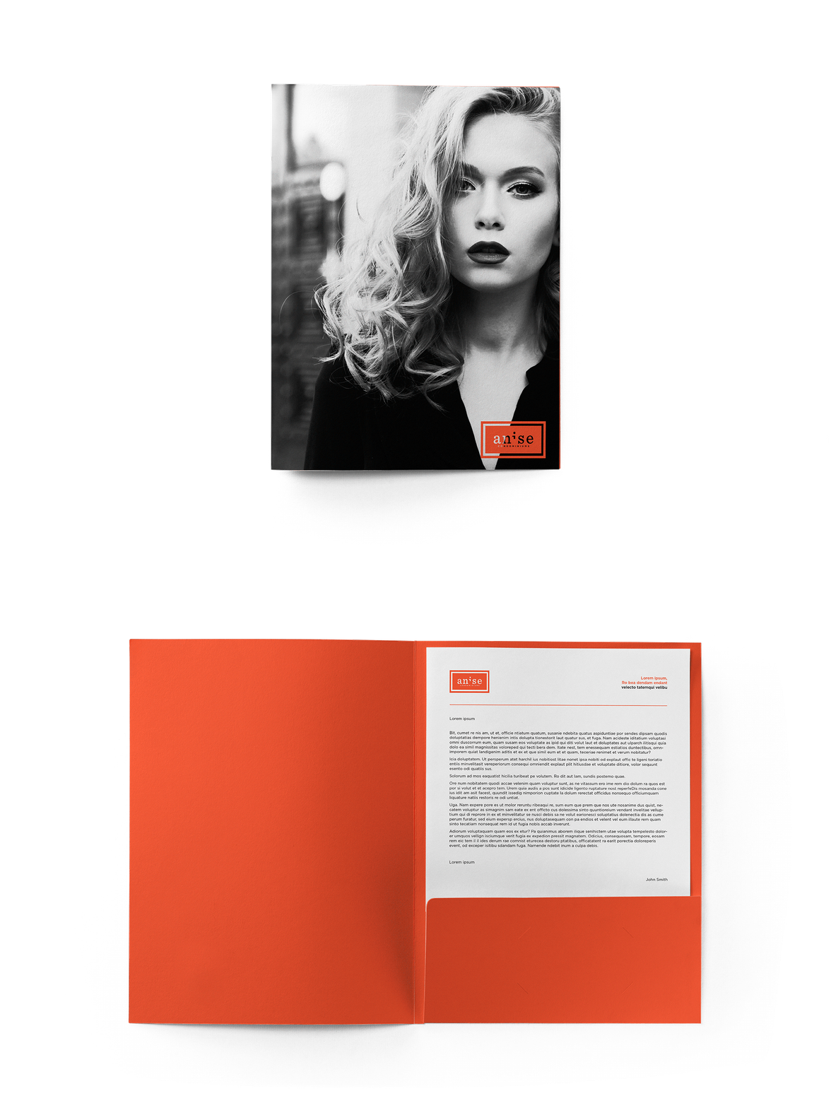
By researching other condominium identities, it is clear wordmarks are utilized quite often, so in order to create an easily recognizable identity a workmark was created. I used a modern typeface, and a bright colour that will be appealing to the target market. The next design was the corresponding brochure, which used big and bold typography and the same bright colour, as well as moody photography, I developed the identity further and gained many assets for the next phases of design. When building the website, I used the same basic photography and typography, as well as the same type structure to recreate the brochure online. When designing the folder, I applied the brand identity that had developed using the photography and bold typography and colours that have become the graphic devices in this campaign.
SOFTWARE USED

